Accessibility Toolkit 2025: Readers, Captions, Contrast
Accessibility Toolkit 2025: Readers, Captions, Contrast
Table of Contents
🧭 What & Why
Accessibility means making your content usable for everyone—including people with disabilities and people in temporary/situational constraints (broken wrist, noisy commute, glare, slow connection). WCAG 2.2 organizes requirements under four principles (POUR): Perceivable, Operable, Understandable, Robust. Aim for Level AA at minimum. W3C
Why now? In 2025, WCAG 2.2 adds practical criteria (e.g., focus not obscured, minimum target size, accessible authentication) that tighten everyday usability, especially on mobile. Upgrading your content and components to WCAG 2.2 also keeps you future-ready. W3C
The need is large: about 1.3 billion people (≈16% of the world) live with significant disability—accessibility is not a niche. World Health Organization
🛫 Quick Start (Do This Today)
-
Headings & Landmarks: Structure your post with one H1, logical H2/H3, and proper landmarks (header/nav/main/aside/footer). Test keyboard Tab order. W3C
-
Alt Text Triage: Add concise, purpose-driven alt text; mark decoratives as empty
alt="". Use the W3C alt decision tree. W3C -
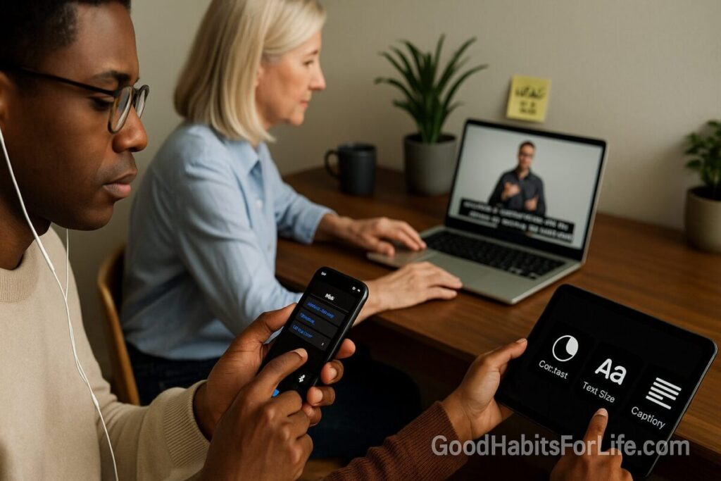
Caption Your Next Video: Provide captions for prerecorded media; plan live captions for webinars. W3C+1
-
Fix Contrast Before Publish: Ensure text contrast ≥ 4.5:1 (normal), ≥ 3:1 (large text & UI components). Verify with a checker. webaim.org+1
-
Make Focus Obvious: Ensure the focus indicator is visible and not hidden by sticky headers or pop-ups. W3C
-
Touch Targets: Buttons/links should be ≥ 24×24 CSS px (or meet spacing exceptions). W3C
✅ Accessibility Foundations (Readers • Captions • Contrast)
🧠 Readers: Design so assistive tech “just works”
-
Semantic HTML (true headings, lists, tables, buttons) lets screen readers announce content correctly and improves navigation. Keyboard access (2.1.1) is required so all functionality works without a mouse. W3C
-
Visible Focus on interactive elements prevents “lost focus” during keyboard navigation (2.4.11/2.4.13). W3C+1
-
Real-world usage: The latest WebAIM Screen Reader Survey shows how (and where) people actually use readers—very often on mobile—so test beyond desktop. webaim.org
Checklist (Readers)
-
One H1; ordered H2/H3; skip links
-
Descriptive link text (“Download guide”), not “Click here”
-
Alt text follows context; decorative images empty
alt -
All actions reachable by Tab/Shift+Tab/Enter/Space
-
Focus ring clearly visible on all controls
🎧 Captions: Comprehension, searchability, equity
-
Prerecorded video: Captions are Level A (SC 1.2.2). Live captions are Level AA (SC 1.2.4). Include non-speech info (music, names, sound cues). W3C+1
-
Learning impact: Decades of research show captions can improve attention, comprehension, and memory for many audiences—not only Deaf/HoH viewers. PMC
Checklist (Captions)
-
Accuracy (target ≥ 99% for edited captions), synchronicity, speaker labels
-
Provide a transcript for audio-only content
-
Review/repair auto-captions before publishing
🎨 Contrast: Readability first
-
Minimums: 4.5:1 for normal text; 3:1 for large text (≥ 18 pt/24 px or ≥ 14 pt/18.66 px bold) and 3:1 for essential UI graphics (borders, icons). webaim.org+1
-
Spacing: Ensure no loss of content if users apply text spacing (line-height 1.5, paragraph spacing 2×, letter-spacing 0.12 em, word-spacing 0.16 em). W3C
Checklist (Contrast)
-
Test body, links (normal/hover/focus/visited), buttons, form borders
-
Check over gradients, images, and on dark mode variants
-
Use a palette pre-vetted for AA/AAA combinations
🗺️ Habit Plan: 30-60-90 Roadmap
Day 0–30 (Foundations)
-
Pick your WCAG 2.2 AA target and publish an A11y statement.
-
Standardize: heading map, alt-text rules, captioning SOP, focus ring tokens, color palette AA.
-
Run a quick audit on top-traffic pages and your base components (header, nav, buttons, forms). W3C
Day 31–60 (Components & Media)
-
Refactor nav, buttons, forms for keyboard + visible focus; set 24×24 px targets.
-
Caption video library; add transcripts to podcasts.
-
Train editors on headings, alt text, and link text (15-min checklist).
Day 61–90 (Scale & Sustain)
-
Bake checks into your CI/content workflow (contrast + keyboard smoke tests).
-
Add periodic screen reader tests (NVDA + VoiceOver + TalkBack) and mobile checks (orientation, zoom).
-
Track issues, fixes, and time-to-repair; schedule quarterly audits.
🛠️ Techniques & Frameworks
-
POUR (Perceivable, Operable, Understandable, Robust): your mental model for every page. W3C
-
WCAG 2.2 highlights to implement now: Focus not obscured (2.4.11 AA), Dragging Movements (2.5.7 AA), Target Size Minimum 24×24 (2.5.8 AA), Accessible Authentication (3.3.8 AA). W3C
-
Cognitive Accessibility (COGA): Use clear language, consistent patterns, and offer help—supplementary guidance beyond WCAG lifts outcomes for neurodivergent readers. W3C
-
Alt Text Decision Tree: Decide when/how to write alt text (and when to use empty alt). W3C
-
ARIA wisely: Prefer native HTML; use ARIA patterns only for custom widgets (menus, tabs) following APG examples. W3C
👥 Audience Variations
-
Students/Teens: Captions + clear headings + chunked text aid focus and review; transcripts help quick search. Evidence shows captions can support comprehension and memory for many learners. PMC
-
Professionals: Keyboard operability + robust focus states speed through forms and dashboards; good contrast reduces eye strain on long workdays. W3C
-
Parents/Seniors: Higher contrast and larger tap targets (≥ 24×24 px) improve confidence on mobile. W3C
-
Neurodivergent readers: Consistent layout, plain language, and visible affordances reduce cognitive load. W3C
⚠️ Mistakes & Myths to Avoid
-
Myth: Auto-captions are “good enough.”
Reality: Always edit—accuracy and speaker labels matter for comprehension and equity. W3C -
Mistake: Styling away the focus ring.
Fix: Keep a high-contrast, thick focus indicator; ensure it isn’t obscured. W3C -
Mistake: Relying on color alone to convey meaning (e.g., red error).
Fix: Add text, icons, or patterns and meet contrast rules. webaim.org -
Myth: Accessibility slows teams down.
Reality: A small, repeatable checklist per post prevents costly rework and broadens reach (16%+ of people). World Health Organization
💬 Real-Life Examples & Scripts
Good alt text patterns
-
Informative image: “Timer set to 25 minutes for a Pomodoro work block.”
-
Decorative flourish:
alt=""(image marked decorative in editor). -
Complex chart: Short alt + link to a data table.
Editor “pre-publish” mini-script (read aloud)
H1 set? Headings nested? Links are descriptive? Alt text written or decorative? Contrast ≥ AA? Captions attached? Keyboard tab order OK? Focus visible?
Request to a webinar vendor (template)
“Please provide live captions during the session and an edited caption file (WebVTT/SRT) and transcript within 48 hours. We’ll review accuracy and speaker labels before posting.”
🧰 Tools, Apps & Resources
-
Contrast: WebAIM Contrast Checker & Link Contrast Checker — fast ratio checks for text/UI. Pros: simple; Cons: manual per color pair. webaim.org+1
-
Screen Readers for testing: NVDA (Windows), VoiceOver (macOS/iOS), TalkBack (Android). Pair with keyboard test and mobile checks (landscape/zoom). webaim.org
-
Linting/Audits: WAVE, axe DevTools, Lighthouse—good at catching common issues; still do manual tests for headings, focus, semantics. (General best practice per WCAG/WAI.) W3C
-
Captions: YouTube Studio (auto then edit), Amara/Subtitle Edit/Descript for precise timing; export .srt/.vtt and upload before publish. (Aligned to SC 1.2.x.) W3C
-
Guides & Patterns: WAI-ARIA Authoring Practices (examples for tabs, menus, dialogs). Use only when native elements can’t. W3C
-
Cognitive usability: W3C “Making Content Usable” for neurodivergent-friendly patterns and plain-language tips. W3C
🔑 Key Takeaways
-
Readers: Build with semantic HTML + keyboard in mind; keep focus visible. W3C+1
-
Captions: Caption prerecorded video and plan live captions; edit for accuracy. W3C+1
-
Contrast: Ship AA contrast and respect user text spacing preferences. webaim.org+1
-
WCAG 2.2: Adopt AA updates (focus, targets, authentication) to future-proof your site. W3C
❓FAQs
1) What’s the minimum color contrast I should meet?
For normal text, 4.5:1; for large text (≥ 18 pt/24 px or ≥ 14 pt bold), 3:1; UI graphics and component boundaries should be ≥ 3:1. webaim.org
2) Are captions required for live streams?
Yes—live captions are Level AA (SC 1.2.4). Prerecorded captions are Level A (SC 1.2.2). W3C+1
3) Do fonts matter for accessibility?
Yes—legible sizing/spacing and avoiding italics/all-caps improve readability; WCAG also requires no loss of content when users adjust spacing. W3C
4) What’s new in WCAG 2.2 that affects typical pages?
Visible, unobscured focus; 24×24 px minimum target size; simpler authentication and reduced re-entry. W3C
5) How do I know if screen reader users can navigate my article?
Test with a keyboard and a screen reader (NVDA/VoiceOver/TalkBack). Confirm headings, landmarks, focus order, link text, and alt text. webaim.org
6) Is meeting AA enough for neurodivergent readers?
AA is a baseline; adding COGA patterns (clear language, consistent help, reduced cognitive load) improves outcomes further. W3C
7) Are dark-mode and high-contrast mode required?
Not mandated by WCAG, but honoring user preferences and maintaining AA contrast in all themes is recommended. webaim.org
📚 References
-
W3C WAI — WCAG 2.2 Overview & POUR principles. https://www.w3.org/WAI/standards-guidelines/wcag/ W3C
-
W3C — What’s New in WCAG 2.2 (new success criteria incl. focus/targets/authentication). https://www.w3.org/WAI/standards-guidelines/wcag/new-in-22/ W3C
-
W3C — Understanding SC 1.2.2 & 1.2.4 (Captions). https://www.w3.org/WAI/WCAG21/Understanding/captions-prerecorded.html and https://www.w3.org/WAI/WCAG21/Understanding/captions-live.html W3C+1
-
WebAIM — Contrast Checker & Contrast Guidance. https://webaim.org/resources/contrastchecker/ and https://webaim.org/articles/contrast/ webaim.org+1
-
W3C — Understanding SC 2.1.1 Keyboard. https://www.w3.org/WAI/WCAG21/Understanding/keyboard.html W3C
-
W3C — Understanding SC 2.5.8 Target Size (Minimum). https://www.w3.org/WAI/WCAG22/Understanding/target-size-minimum W3C
-
W3C — Understanding SC 2.4.11 & 2.4.13 Focus. https://www.w3.org/WAI/WCAG22/Understanding/focus-not-obscured-minimum and https://www.w3.org/WAI/WCAG22/Understanding/focus-appearance W3C+1
-
W3C — Alt Text Decision Tree. https://www.w3.org/WAI/tutorials/images/decision-tree/ W3C
-
W3C — Text Spacing (SC 1.4.12). https://www.w3.org/WAI/WCAG22/Understanding/text-spacing.html W3C
-
WebAIM — Screen Reader User Survey #10 (2024). https://webaim.org/projects/screenreadersurvey10/ webaim.org
-
W3C WAI-ARIA — Authoring Practices Guide. https://www.w3.org/WAI/ARIA/apg/ W3C
-
WHO — Disability & Health Fact Sheet (1.3 B / 16%). https://www.who.int/news-room/fact-sheets/detail/disability-and-health World Health Organization
-
Gernsbacher, M.A. (2015) — Video Captions Benefit Everyone (review). https://www.ncbi.nlm.nih.gov/pmc/articles/PMC5214590/ PMC