DyslexiaFriendly Reading: Fonts, Formats, Flow
DyslexiaFriendly Reading: Fonts, Formats, Flow
Table of Contents
🧭 What & Why
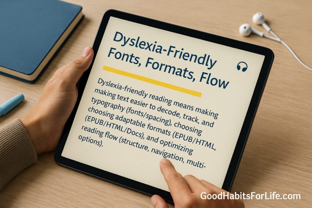
“Dyslexia-friendly reading” means making text easier to decode, track, and understand by tuning typography (fonts/spacing), choosing adaptable formats (EPUB/HTML/Docs), and optimizing reading flow (structure, navigation, multi-modal options). Good design reduces cognitive load, supports attention and memory, and benefits many readers—not only those with dyslexia. W3C+1
Benefits you can expect
-
Less visual clutter → fewer rereads and regressions
-
Better scanning → faster finding of key info
-
Longer stamina with multi-modal support (reading + listening)
-
Easier personalization across devices
✅ Quick Start (Do This Today)
-
Switch to a clean font + size
-
Use Arial, Verdana, Tahoma, Calibri, Noto Sans, Lexend, Atkinson Hyperlegible.
-
Set 14–16 pt (≈ 18–22 px), line-height ~1.5, left-align (ragged right), no full justification.
-
Keep line length ~60–70 characters; avoid narrow newspaper-style columns. thedyslexia-spldtrust.org.uk
-
Increase spacing if it helps
-
Try letter-spacing +0.05–0.12 em and word-spacing +0.16 em (content should remain usable at these values). W3C
-
Pick adaptive formats
-
Prefer web pages, Google Docs, or EPUB you can resize/reflow; avoid fixed-layout PDFs when possible. W3C
-
Use a Reader Mode + TTS
-
Turn on your browser’s Reader Mode and Read Aloud; on phones enable Speak Screen/Select-to-Speak. Combine listening with following the text. AEM Center
-
Tidy the page
-
Add a Table of Contents; use short paragraphs (2–5 lines), descriptive headings, and bulleted lists. World Institute on Disability
🛠️ Habit Plan: 7-Day DyslexiaFriendly Setup
Day 1 — Baseline & Goals
-
Time yourself reading 800–1,000 words in your current setup. Note fatigue, rereads, and comprehension (3 quiz questions you make).
Day 2 — Fonts & Size
-
Test 3 fonts (e.g., Arial, Verdana, Lexend) at 18–22 px. Keep the fastest/most comfortable.
Day 3 — Spacing & Alignment
-
Set line-height 1.5; try letter-spacing +0.05–0.1 em; ensure left-align and ~60–70-character line length.
Day 4 — Format Shift
-
Move key documents into Google Docs/EPUB/web. Convert stubborn PDFs or request an alternate format.
Day 5 — Reader Mode + TTS
-
Read 15–20 minutes with Reader Mode + Read Aloud; follow along with the text.
Day 6 — Navigation Flow
-
Add a ToC/bookmarks; highlight headings; use a timer (20–25-minute blocks) and short breaks.
Day 7 — Review & Lock In
-
Re-time the same 800–1,000-word passage. Keep the settings that measurably improved your speed, comprehension, or comfort.
🧠 Techniques & Frameworks: Fonts • Formats • Flow
Fonts (clarity over novelty)
-
What to try first: Arial, Verdana, Tahoma, Calibri, Noto Sans, Lexend; also consider Atkinson Hyperlegible (for low-vision clarity). Research suggests sans-serif faces often perform better than serif/italic for dyslexic readers; specialty “dyslexia fonts” do not consistently outperform standard faces. Test and pick what feels best. ACM Digital Library+1
-
Size: Start 18–22 px (14–16 pt); increase on small screens.
-
Weight: Regular to semi-bold for body; avoid italics (use bold for emphasis). thedyslexia-spldtrust.org.uk
-
Spacing: Line-height ~1.5; letter-spacing up to +0.12 em without breaking layouts (WCAG 2.1/2.2 Text Spacing). W3C
Evidence snapshot: Several studies (e.g., Rello & Baeza-Yates) found Helvetica/Arial/Verdana and similar sans-serifs to be good candidates; more recent work shows no reliable reading-performance advantage for branded dyslexia fonts like Dyslexie/OpenDyslexic. ResearchGate+1
Formats (make text adaptable)
-
Best default: Web/HTML, Google Docs, EPUB—they reflow, let readers change font/size/spacing, and pair well with TTS.
-
EPUB accessibility is standardized; it supports rich navigation, alt text, and personalization. W3C
-
Avoid fixed PDFs when possible (hard to reflow, small type, zoom fatigue). If you must use PDF, export tagged PDFs and keep lines short. W3C
Flow (reduce cognitive load)
-
Front-load the gist with a summary/TL; use descriptive headings, short paragraphs, lists, and a visible ToC to aid orientation.
-
Apply plain-language principles: active voice, common words, logical order. World Institute on Disability
-
Audio-supported reading (ASR): listen while tracking text to sustain attention and pace. AEM Center
👥 Audience Variations
Students
-
Use EPUB/Docs for textbooks; pair Reader Mode + Read Aloud for study sessions. Build a personal style preset (font/size/spacing) and stick to it class-to-class. dl.daisy.org
Parents & Educators
-
Share materials in both printable PDF and an editable/reflowable version (Doc/EPUB). Provide ToC, summaries, and audio where possible. AEM Center
Professionals
-
Request slide decks and reports as Docs/HTML ahead of meetings; use Reader Mode during briefings. Add a one-page executive summary with bullets. plainlanguage.gov
Seniors & Teens
-
Seniors: prioritize larger type, higher contrast, and clean navigation. Teens: optimize for mobile (bigger base size; shorter paragraphs).
⚠️ Mistakes & Myths to Avoid
-
“A special font will fix it.” Evidence doesn’t support universal performance gains from Dyslexie/OpenDyslexic; treat them as options to try, not cures. SpringerLink
-
Full justification. Creates rivers/uneven spacing—left-align instead. thedyslexia-spldtrust.org.uk
-
Wall-of-text pages. Break content into short paragraphs and lists; add a visible ToC. World Institute on Disability
-
Overreliance on colored overlays. Research on overlays/lenses is mixed to negative; focus on proven layout and instruction strategies first. PMC+1
🗣️ Real-Life Examples & Scripts
Email your teacher/manager
Subject: Accessible version request
Hi [Name], could you please share this document in a reflowable format (Google Doc/EPUB/HTML) instead of PDF? I use a larger font (18–22 px), 1.5 line-height, and Reader Mode/TTS to follow along. Thanks!
Meeting prep
Could we circulate the agenda as a Google Doc with headings, bullets, and a short summary at the top? It helps me scan and stay on track.
Library/textbook request
Do you have an EPUB or audio-supported version of this book? I read best when I can adjust font/spacing and listen while following the text. AEM Center
🧰 Tools, Apps & Resources (Pros & Cons)
| Tool/Feature | What it does | Pros | Cons |
|---|---|---|---|
| Browser Reader Mode (Edge, Safari, Chrome) | Simplifies pages; lets you resize text and often read aloud | Free, quick, reduces clutter | Not perfect on complex pages |
| Text-to-Speech (TTS) (system or browser) | Reads text while you follow along | Supports audio-supported reading; great for stamina | Voices vary; may require setup AEM Center |
| EPUB readers (Apple Books, Thorium, Calibre) | Reflowable, customizable reading | Font/size/spacing control; ToC navigation | Requires compatible files W3C |
| Fonts (Lexend, Atkinson Hyperlegible) | Legibility-focused typefaces | Many readers like them; free on Google Fonts | Try, don’t assume performance gains Google Fonts+1 |
| Google Docs / Word online | Reflowable docs with headings and ToC | Collaborative; easy formatting | Needs consistent style discipline |
📌 Key Takeaways
-
Clarity beats novelty: choose a clean sans-serif, 14–16 pt, 1.5 line-height, left-aligned, ~60–70 characters per line. thedyslexia-spldtrust.org.uk
-
Reflow matters: prefer web/Docs/EPUB + Reader Mode over fixed PDFs. W3C
-
Mix modalities: listen and read for stamina and comprehension. AEM Center
-
Test, measure, keep what works: there’s no one perfect font for everyone. SpringerLink
❓ FAQs
What is the single best font for dyslexia?
There isn’t one; start with Arial, Verdana, Tahoma, Calibri, Noto Sans, or Lexend, then test comfort and speed. ACM Digital Library
Are Dyslexie/OpenDyslexic proven to work?
Studies haven’t shown consistent reading-performance advantages over standard sans-serifs. Try them—but don’t expect a cure. SpringerLink
What background/contrast should I use?
High contrast helps; some prefer off-white backgrounds to reduce glare. Prioritize reader control so users can adjust.
Is PDF always bad?
No—but fixed PDFs often resist reflow and scaling. Provide an editable/reflowable version whenever possible. W3C
Does letter and line spacing really help?
Yes—content should remain usable when users increase spacing to WCAG’s recommended thresholds (line-height 1.5, etc.). W3C
Is listening to text “cheating”?
Not at all. Audio-supported reading is an evidence-based way to sustain pace and comprehension. AEM Center
How long should paragraphs be?
2–5 lines with meaningful headings and lists work best for scanning and comprehension. World Institute on Disability
📚 References
-
British Dyslexia Association — Dyslexia Style Guide (layout, spacing, alignment). PDF appliedmicrobiology.org
-
W3C WAI — Understanding WCAG 2.1 SC 1.4.12: Text Spacing. Web W3C
-
W3C — Making Content Usable for People with Cognitive and Learning Disabilities (COGA). Web W3C
-
Rello, L. & Baeza-Yates, R. — Good Fonts for Dyslexia (ACM ASSETS). Paper ACM Digital Library
-
Kuster, S.M. et al. — Dyslexie font does not benefit reading in children with or without dyslexia. Journal article SpringerLink
-
International Dyslexia Association — Do Special Fonts Help People with Dyslexia? Brief International Dyslexia Association
-
AEM Center (CAST) — Using Accessible Formats. Web AEM Center
-
W3C — Fixed-Layout EPUB Accessibility: Challenges & Best Practices. Guidance W3C
-
AEM Center — Audio-Supported Reading & Students with Learning Disabilities. Brief AEM Center
-
UK Home Office (GDS) — Designing for users with dyslexia (poster). Web Home Office
-
Federal Plain Language Guidelines — U.S. Govt. PDF World Institute on Disability
Disclaimer: This guide is educational and not medical or clinical advice; consult qualified professionals for diagnosis or treatment.