Data Literacy 101: Charts You Can Trust
Data Literacy 101: Read Charts You Can Trust
Table of Contents
🧭 What & Why
Data literacy is the ability to read, work with, analyze, and argue with data. At minimum, it means you can interpret charts accurately, question assumptions, and make better decisions. A practical definition used across governments and development orgs frames data literacy as skills to access, interpret, critically assess, and use data. USEReady
Reliable chart reading saves you from costly mistakes—like acting on a spike that was just random noise, or a “regional hotspot” that disappears once you adjust for population or age. Seven-day moving averages smooth daily volatility but can also hide short-term spikes—use them knowingly. CDC Archive+2CDC Stacks+2
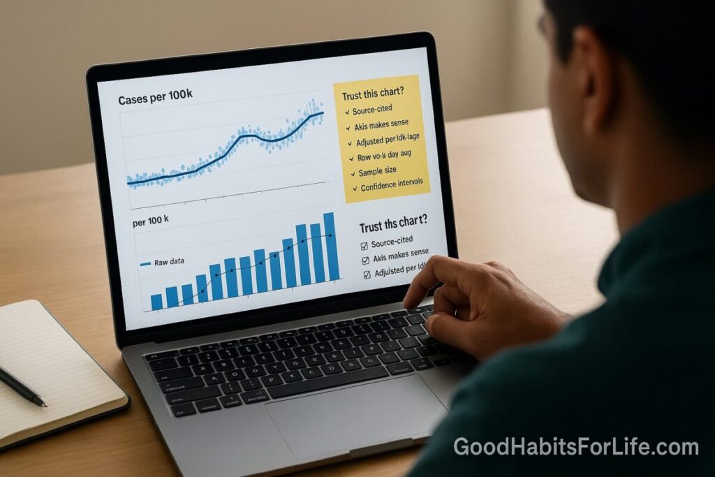
✅ Quick Start Checklist
Use this 60-second scan before trusting any chart:
-
Chart type fits the question? (comparison, trend, composition, distribution) Service manual
-
Axes honest? Bars start at zero; line charts may start above zero but must be labeled. Avoid dual axes. Service manual+2Service manual+2
-
Time window fair? No cherry-picked start/end dates; consistent time scale. Service manual
-
Denominator right? Rates (per 100,000) instead of raw counts; age-adjust if comparing populations. Service manual+1
-
Uncertainty shown? MOE/CI or ranges displayed or linked. Service manual+1
-
Color & accessibility okay? Contrast ≥4.5:1; color-safe palettes. W3C+1
-
Source credible & reproducible? Publisher, method, and data link present. Service manual
🛠️ 7-Day Habit Plan (Starter)
Goal: Make trustworthy chart reading automatic.
-
Day 1 (Axes): Review 10 screenshots; flag any truncated bar axes or unlabeled non-zero line axes. Service manual+1
-
Day 2 (Denominators): Convert two “top states” charts from counts to rates (per 100k). Note rank changes. Service manual
-
Day 3 (Uncertainty): For one survey chart, compute a 95% confidence interval from MOE; decide if two bars truly differ. Census.gov
-
Day 4 (Smoothing): Compare raw daily series vs 7-day moving average; write when smoothing helps vs harms. CDC Archive
-
Day 5 (Maps): Recreate a choropleth using standardized rates; try a 5-band sequential palette. Service manual+1
-
Day 6 (Color & Access): Run contrast checks (4.5:1) and test a colorblind-safe palette. W3C+1
-
Day 7 (Ethics & Sources): Write a 6-question “trust script” (below) you’ll ask for every chart. analysisfunction.civilservice.gov.uk
🧠 Techniques & Frameworks
1) Chart–Question Fit
-
Comparisons: Bars (sorted) beat pies; use 100% stacked bars for composition shares. Service manual
-
Trends: Lines for continuous time; columns for discrete periods (still start at zero). Service manual
-
Crowded trends: Prefer small multiples over multi-line spaghetti. Keep scales consistent across panels. Service manual
2) Axes, Scales & Dual Axes
-
Bars/columns: Always start y-axis at zero; otherwise the visual length misleads. Service manual+1
-
Lines/scatters: You may crop to show variation, but label clearly and avoid exaggeration. Service manual
-
Dual axes: Avoid; trends on different scales appear correlated when they aren’t. Use two charts or annotate one. Service manual
3) Denominators, Standardization & Fair Comparisons
-
Rates over counts: In maps, show standardized rates (e.g., per 100,000), not totals. Service manual
-
Age-adjusted rates: When populations differ by age, compare age-adjusted metrics. CDC+1
4) Uncertainty & Statistical Thinking
-
Margins of Error (MOE): A point estimate without MOE is incomplete. For surveys, pair the estimate with its CI. Census.gov
-
P-values ≠ proof: Treat p-values as compatibility measures with a model; don’t equate them with effect importance. Taylor & Francis Online+1
-
Show ranges: Visualize uncertainty with CIs or bands; avoid raw SEs in charts (hard to interpret). Service manual
5) Smoothing & Rolling Averages
-
Use to reduce noise, but disclose method (e.g., 7-day mean) and watch for hidden spikes or shifts. CDC Archive+1
6) Accessibility & Color
-
Contrast: Minimum 4.5:1 for normal text; 3:1 for large text/icons. W3C+1
-
Color choice: Prefer tested palettes (e.g., ColorBrewer) with colorblind-safe options. colorbrewer2.org
👥 Audience Variations
-
Students/Teens: Practice the Quick Start on school infographics; explain MOE in one sentence. Census.gov
-
Professionals: Enforce a “no dual-axis” rule in reports; require a data source link for every figure. Service manual
-
Parents/Seniors: Focus on denominators (per 100k) and simple legends; avoid rainbow palettes. Service manual
⚠️ Mistakes & Myths to Avoid
-
“If it’s in a chart, it’s true.” No—check source, method, and uncertainty. Service manual
-
“Dual axes are fine if colored differently.” Still risky—split into two charts. Service manual
-
“Maps always help.” Not if there’s no geographic pattern or only a few regions—use bars. Service manual
-
“Counts equal risk.” Use rates, and age-adjust when comparing populations. CDC
-
“Smoothing is neutral.” It changes what you see—state the method and limits. CDC Stacks
💬 Real-Life Examples & Scripts
Copy-paste these when you need more detail:
-
“What denominator did you use (per 1,000 or per 100,000)? Is the rate age-adjusted?” CDC
-
“Why does this bar chart not start at zero? Could we switch to a line to zoom the variation?” Service manual
-
“Please include MOEs or 95% CIs for each estimate (or link to a table).” Census.gov
-
“Can we avoid the dual-axis and plot two panels or annotate one axis instead?” Service manual
-
“For the map, can we show rates rather than totals and use ~5 bands?” Service manual
🧰 Tools, Apps & Resources
-
Financial Times Visual Vocabulary (chart choice guide). U.S. Web Design System (USWDS)
-
ONS Data Visualisation Guidance (axes, uncertainty, ordering). Service manual
-
U.S. Census: Data Visualization Best Practices (labels, axes, color, maps). Nature
-
CDC Data Viz Guides (public health examples, rolling averages). Fountn
-
ColorBrewer (tested color-blind-safe palettes). colorbrewer2.org
-
W3C WCAG (contrast rules & checks). W3C
📚 Key Takeaways
-
Match chart type to question; avoid decorations that blur meaning. Service manual
-
Keep bars at zero, label cropped axes for lines, and ban dual axes. Service manual+1
-
Prefer rates over counts; age-adjust for fair comparisons. Service manual+1
-
Demand uncertainty (MOE/CI) and disclose smoothing. Census.gov+1
-
Ensure accessibility with proper contrast and color-safe palettes. W3C+1
❓ FAQs
1) Should all charts start at zero?
Bar/column charts yes (length encodes value). Line charts may crop for clarity—but label and avoid exaggeration. Service manual+1
2) When do I use rates instead of counts?
When population sizes differ across places or groups (e.g., cases per 100,000). For age-skewed groups, use age-adjusted rates. Service manual+1
3) Why are dual-axis charts discouraged?
They imply spurious relationships; show two charts or annotate a single axis. Service manual
4) What’s a margin of error and why should I care?
MOE indicates sampling uncertainty; pair estimates with their CI to judge real differences. Census.gov
5) Are 7-day averages better than daily counts?
They reduce noise but can mask short spikes; disclose the smoothing window. CDC Archive
6) How do I make charts readable for everyone?
Use WCAG contrast (≥4.5:1) and color-blind-safe palettes (e.g., ColorBrewer). W3C+1
7) What’s “age-adjustment” in simple terms?
A method that removes age-structure differences so you can compare like-for-like across populations or time. CDC
8) Is statistical significance the same as importance?
No. P-values gauge data–model compatibility; consider effect sizes and context. Taylor & Francis Online
9) Should maps always be used for geographic data?
No. If there’s little spatial pattern or few regions, bars are clearer. Service manual
10) How many color bands on a choropleth?
Typically five (diverging up to six), with meaningful breaks. Service manual
References
-
PARIS21 – A Data Literacy Primer: Measuring and Building Data Literacy (OECD partnership). USEReady
-
Office for National Statistics – Axes and gridlines (zero baselines, dual-axis cautions). Service manual+1
-
ONS – Column chart (axis must start at zero). Service manual
-
ONS – Choropleth maps (use standardized rates; when to map). Service manual
-
ONS – Showing uncertainty in charts. Service manual
-
U.S. Census Bureau – Data Visualization Best Practices. Nature
-
U.S. Census Bureau – What Is the Margin of Error? (Data Gem). Census.gov
-
CDC NCHS – Age adjustment – Health, United States. CDC
-
CDC – COVID-19: Using 7-Day Moving Averages (examples). CDC Archive
-
American Statistical Association – Statement on Statistical Significance and P-Values. Taylor & Francis Online
-
W3C – Understanding WCAG 2.0: Contrast (Minimum) & Technique G18. W3C+1
-
Financial Times – Visual Vocabulary (chart selection). U.S. Web Design System (USWDS)
-
ColorBrewer – Color Advice for Maps. colorbrewer2.org